How to improve the visibility and desirability of your OSINT tool
Learn how to create a strong brand identity and design an effective landing page to increase conversions.

In a saturated market, where many companies offer similar solutions, a unique brand identity and well-designed website becomes crucial. Brand identity makes businesses stand out, that's how they become memorable. Having a good landing page helps to better communicate your value and increase conversions.
Make your brand recognisable
A well-designed brand identity creates a bond between you and your customer. The way you use visuals to evoke emotions and tell the story defines how professional and trustworthy you are.
You might not see much value in brand identity, because your product has great features anyway. However, delivering features is not enough anymore. People expect more: they need the dopamine hit they receive using OSINT tools with beautiful colours, solid typography and catchy logos. OSINT Industries recognised it a long time ago and launched with a nicely designed landing page. I heard a lot of good comments on how their product looked. Using a design-first approach OSINT Industries formed an authoritative and trustworthy image.

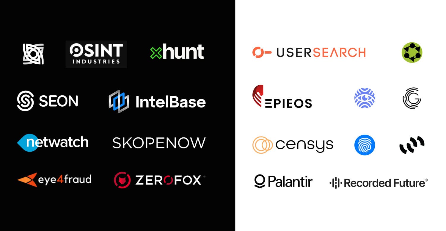
To make your product visible you will need a catchy logo. Your competitors have already done it, so people would expect the same from you. To give an overview of the landscape, I have picked some good logos in the OSINT space.

While these are good logos, not all of them are perfect. For example, Castrick Clues (fingerprint in the blue circle) has the right proportions for the favicon, but the fingerprint symbol is too generic. A logo has to be unique, otherwise it will not stand out and will be mixed with competitors or other visuals.

Many companies go with the "eye" or "magnifying glass" symbol. Using such symbols effectively communicates search and investigation intent. Considering these are good options, there are many others; to uncover them you have to dig deeper. Analysing associations on your mind map you will come up with a unique logo and be able to build a memorable brand identity. Here is how I've created the logo for the blog you are reading right now:

Get a well-designed landing page
I have already mentioned the impact of the first impression. A landing page is where visitors become your customers. The way you present your product value and showcase features plays an important role in their decision making. Is your value proposition clear? Do you communicate benefits of your platform? Answers to those questions will determine your conversions.
Put value proposition upfront
People are constantly distracted by notifications, opened browser tabs and the environment they are in. Unless you create a strong hook they will leave your website. You have to make them scroll down when they just land on the website and to do it successfully you have to communicate the value of your product. If it matches their needs and promises to solve the problems they are having - you have got their attention.

Show your authority
Authority can be showed in multiple ways: success you have achieved, notable customers you have acquired or anything else of which you are proud. Don't hide your achievements, showcase them to attract even more customers.

Use social proof
Social proof involves leveraging testimonials, reviews, case studies, and endorsements to build trust and credibility with potential users. Include quotes from satisfied users who have benefited from your OSINT tool. Ensure these testimonials are specific, highlighting particular features or results. Display any awards, certifications, or recognitions your tool has received.

Define your target audience
Speaking to your target audience is crucial for the success of your OSINT tool because it ensures your messaging resonates with the specific needs and pain points of your potential users. Understanding your audience allows you to tailor features and benefits that directly address their challenges, making your tool more relevant and appealing.
Working with Offensive OSINT to improve the landing page for his Open-Source Surveillance tool I researched the target audience, defined their needs and compressed the value proposition into short, but compelling sentences.

Overall, the whole website structure revolved around the target audience. I analysed what activities law enforcement, cybersecurity professionals and other OSINT researchers perform on a daily basis to understand how to make the landing page more engaging. As a result, I came up with the following structure:

Constantly test and improve
Design process doesn't finish when your website gets developed. You have to test how well it performs, collect feedback and iterate using collected data. Having new insights you can design a better version of what you have, just like Skopenow did.

A new landing page has a much more compelling message, cool animations and looks much more professional (the way they used colours played an important role).

Conclusion
To conclude, having a unique brand identity and a well-designed website is essential for distinguishing your business and building trust. Now you've seen real examples where design played an important role in increasing user experience and revenue. If you decided this is something your business needs, you are welcome to contact me. Learn more about my process and get contact details at uiuxdesign.work.
